
Patio-to-Interior Flow: Coordinating Exterior and Interior Paint for Seamless Spring-Summer Living Spaces
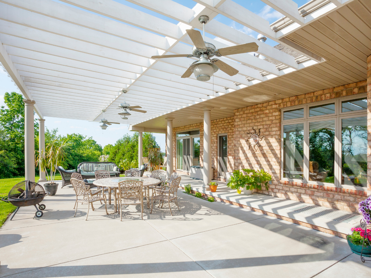

As the weather warms up in May, homes naturally shift into a more open, connected way of living. Doors stay open longer, patios become extensions of living rooms, and outdoor entertaining becomes part of everyday life.
That’s why one of the biggest design trends heading into spring and summer is creating a seamless indoor-outdoor flow—where your interior and exterior paint colors work together to make your home feel cohesive, spacious, and intentional.
At Fresh Coat Painters Hudson and Medina, we help homeowners design cohesive paint color palettes that connect patios, decks, and interiors for a smooth transition between spaces.
Why Indoor-Outdoor Color Flow Matters
When your interior and exterior colors clash, the transition between spaces can feel abrupt. But when they complement each other, your home feels larger, more open, and more modern.
Coordinated color flow can:
- Make small homes feel more spacious
- Improve visual continuity between rooms and outdoor areas
- Enhance natural light and brightness
- Create a more relaxing, resort-like atmosphere
- Increase overall aesthetic appeal
This is especially important in May, when outdoor living becomes a major part of daily life.
How to Create a Seamless Paint Transition
You don’t need identical colors inside and out—you just need a thoughtful connection between tones, undertones, and finishes.
1. Start with a Base Neutral
Choose a core neutral that can carry through your main living areas. This might be a warm white, soft gray, or light beige that works well with both natural light and outdoor surroundings.
2. Pull From Exterior Elements
Look at your home’s exterior materials—brick, siding, roofing, stonework, or landscaping. These elements can inspire your interior palette.
3. Use Accent Colors to Bridge Spaces
Accent colors can help connect the indoors and outdoors. For example:
- Sage green from landscaping
- Soft blues from sky tones
- Warm earth tones from brick or stone
Best Exterior Paint Colors for Flow
Your exterior sets the tone for everything inside. In spring and summer, homeowners often choose colors that feel natural and inviting.
Popular exterior directions include:
- Soft greige tones for a modern neutral base
- Warm whites for clean, bright curb appeal
- Muted greens that blend with landscaping
- Charcoal accents for depth and contrast
These colors transition easily into interior palettes without feeling disconnected.
Best Interior Colors That Extend Outdoor Living
To strengthen the indoor-outdoor connection, interior colors should feel light, airy, and connected to nature.
Top choices include:
- Soft white walls for maximum light reflection
- Light taupe or beige for warmth and balance
- Pale blue for a calming, open feel
- Muted green for a natural extension of outdoor space
These tones work especially well in open-concept homes where patios or decks are visible from main living areas.
Don’t Forget Finishes and Sheen Levels
Color is only part of the equation—paint finish also affects how connected your spaces feel.
- Satin finishes work well in shared living spaces and reflect light beautifully
- Eggshell finishes offer a softer, more subtle interior look
- Durable exterior finishes protect your home while maintaining consistent tone and depth
Using complementary finishes helps maintain visual harmony between inside and outside surfaces.
Key Spaces That Benefit Most from Color Coordination
Some areas of the home benefit more than others when creating flow between indoor and outdoor living:
- Kitchen and dining areas that open to patios
- Living rooms with sliding or French doors
- Sunrooms or enclosed porches
- Decks, patios, and outdoor seating areas
- Entryways visible from exterior spaces
These are the spaces where cohesive design has the biggest visual impact.
Common Mistakes Homeowners Make
When trying to coordinate interior and exterior paint, homeowners often run into a few issues:
- Choosing colors that are too similar but slightly mismatched in undertone
- Ignoring how natural light changes color perception
- Using overly bold exterior colors that don’t translate indoors
- Forgetting to coordinate trim and accent colors
- Overcomplicating palettes instead of keeping them simple and unified
A well-balanced palette is usually more effective than a complex one.
DIY vs. Professional Color Coordination
While selecting paint colors may seem simple, achieving true flow between interior and exterior spaces takes experience with lighting, undertones, and finishes.
A professional painter can help:
- Match undertones across different lighting conditions
- Create a cohesive whole-home color palette
- Recommend durable, high-quality paint systems
- Ensure consistent application and finish quality
This results in a home that feels intentionally designed—not pieced together.
Fresh Coat Painters Hudson and Medina Creates Seamless Spaces
At Fresh Coat Painters Hudson and Medina, we specialize in helping homeowners design and execute cohesive paint plans that connect indoor and outdoor living.
From modern home paint colors to full exterior transformations, we make it easy to create a smooth, stylish transition between your patio and your living room.
This spring and summer, your home shouldn’t feel divided—it should feel connected, open, and ready for the season.