Creating a Welcoming Vibe: Paint Color Ideas for Retail and Hospitality Businesses

In the retail and hospitality industries, first impressions aren’t just important—they’re everything. A potential customer makes a judgment within seconds of walking through your door. While layout and lighting play their part, your paint colors may be doing more work than you realize. Color sets the emotional tone of your space, impacts purchasing behavior, and creates lasting brand impressions.
Whether you're refreshing a boutique, restaurant, salon, or hotel lobby, smart color choices can help you stand out—and keep customers coming back.
Why Paint Color Matters in Retail and Hospitality
Paint color isn’t just about aesthetics—it’s psychology. Color impacts mood, behavior, and perception of your brand.
- Warm tones (reds, oranges, and yellows) can create energy and urgency. Great for fast-paced restaurants or retail spaces that thrive on high turnover.
- Cool tones (blues, greens, and purples) often inspire trust, calmness, and serenity—ideal for spas, salons, or hotels.
- Neutrals (grays, taupes, and soft whites) allow products or furnishings to take center stage and feel modern and clean.
In short: Color tells your customer how to feel. Are you encouraging them to linger? Act quickly? Relax and stay a while? Your paint should support that message.
Retail Spaces: Choosing Colors That Convert
Retail stores have one job: move product. The right colors can increase dwell time, enhance brand recognition, and subtly guide shoppers through the store.
Use color zones
If your store has multiple departments (e.g., accessories, apparel, seasonal displays), use varying color schemes to distinguish zones while keeping your brand’s palette cohesive. This helps with wayfinding and encourages exploration.
Accent walls for promotional areas
Highlight high-margin or seasonal items with a bold accent color behind your display. Bright oranges, magentas, or even contrasting blacks can create visual interest and signal importance.
Brand alignment is key
Your wall colors should reflect your logo and broader brand feel. A rustic, eco-focused store may lean into sage greens or sand tones, while a modern tech-forward shop might incorporate deep charcoal or electric blue.
Hospitality Spaces: Colors That Invite, Relax, and Impress
In hospitality, your guests are buying an experience. That experience begins the moment they step into your lobby or dining area.
Hotels and lodges
-
- Lobby areas should feel grand yet inviting. Rich navy, warm beige, or even a moody olive green can set an upscale yet comfortable tone.
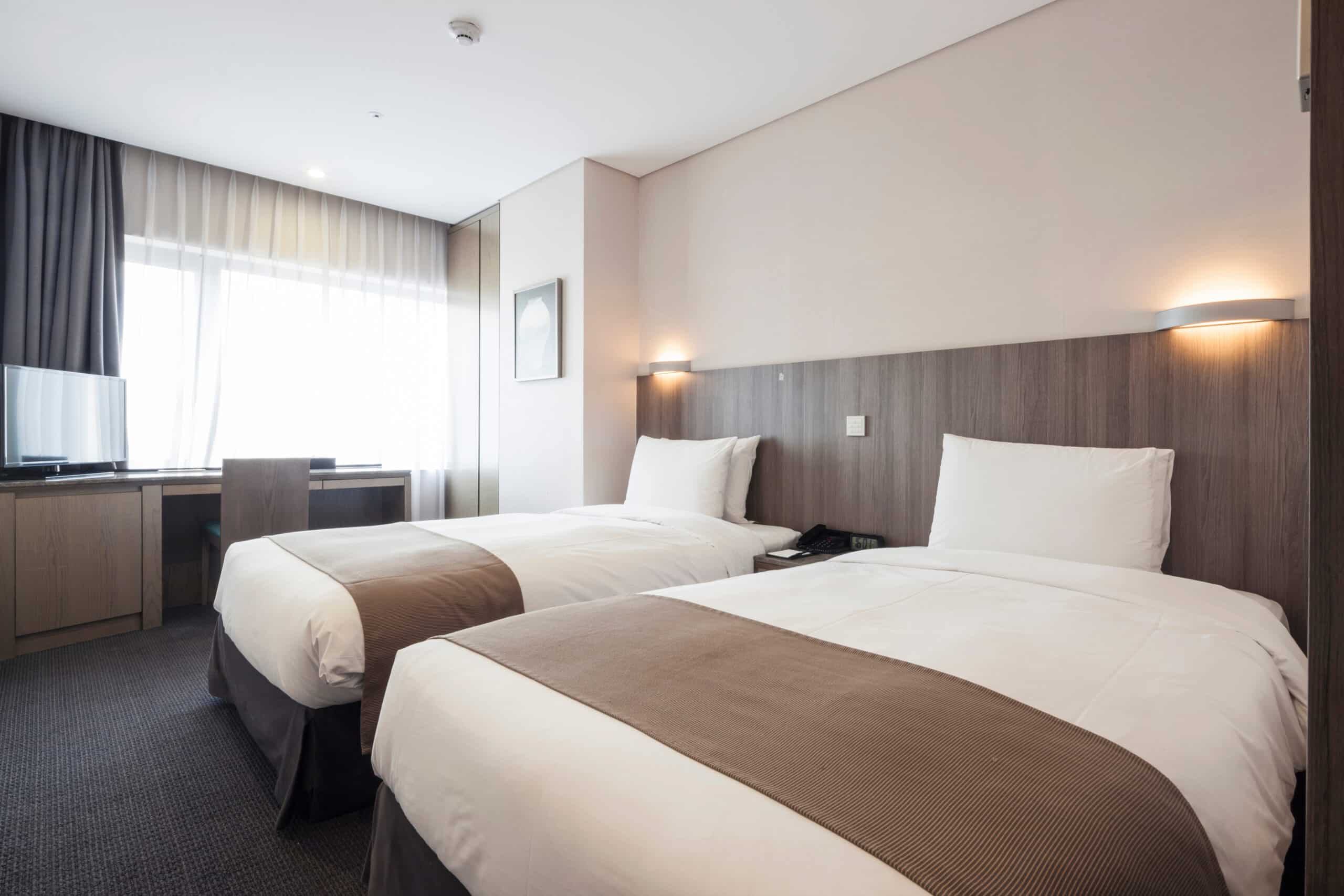
- Rooms benefit from calming tones. Think dusty blues, soft taupes, or muted greiges—colors that help travelers unwind after a long day.
-
- Accent colors, used in moderation, can create memorable brand touches: a burnt orange stripe, a golden headboard wall, or a deep plum doorframe.
Restaurants and cafés
Food service establishments benefit from intentional color planning:
-
- Earthy tones (terra cotta, mustard, olive) evoke natural flavors and pair well with rustic or farm-to-table cuisine.
- Dark hues (charcoal, eggplant, espresso) elevate the dining experience and encourage longer stays—a boon for fine dining.
- Lighter colors (creams, pale sage, soft coral) make small cafés feel airy and cheerful—ideal for quick, casual dining.
Lighting and Space Size Matter Too
Even the perfect paint color can fall flat if lighting and space aren’t considered.
- Natural light can enhance warm tones but wash out cooler ones.
- Low lighting (common in upscale restaurants) may call for deeper, more saturated colors to avoid a washed-out look.
- Small spaces benefit from lighter colors to avoid a cramped feeling.
- High-traffic areas may need darker or more forgiving tones (think charcoal, mocha, or mid-tone blues) that won’t show scuffs easily.
Don’t Forget Durability and Finish
Retail and hospitality spaces see heavy foot traffic and frequent touch—especially on doors, counters, and lower walls.
- Satin and semi-gloss finishes are easier to clean and more durable, ideal for high-traffic zones.
- Matte finishes can be beautiful but are best reserved for ceilings or less-touched walls to avoid fingerprints and scuffs.
- For restaurants, consider low-VOC or scrubbable paints that hold up to health and safety standards without sacrificing style.
Trends to Watch in 2025
As tastes evolve, so do color trends. For businesses that want to feel current:
- Earthy palettes are still dominating: think clay, sage, ochre, and stone.
- Unexpected pairings—like soft peach with steel blue, or tan with mint—are being used to create contemporary visual contrast.
- Color drenching (painting walls, trim, and ceilings all in one tone) is being used in lounges and tasting rooms to create immersive, bold environments.
Even if your brand leans timeless, incorporating a trend-forward accent wall or restroom refresh can modernize your space without a full overhaul.
Let Color Work for You
Choosing a paint color is more than picking what looks good on a swatch. It’s about building a mood, guiding behavior, and aligning every square foot of your space with your business goals. And for retail and hospitality, it’s a direct investment in customer satisfaction.
Serving Hudson & Medina’s Commercial Paint Needs
If your space needs a color refresh that speaks directly to your customers, our expert team is ready to help. We serve retail stores, cafés, restaurants, hotels, and salons throughout Hudson, Medina, and surrounding areas—offering durable, brand-aligned finishes that leave a lasting impression.
Let’s talk color. Schedule your commercial painting consultation today!