
Best Exterior Paint Color Combinations for Homes
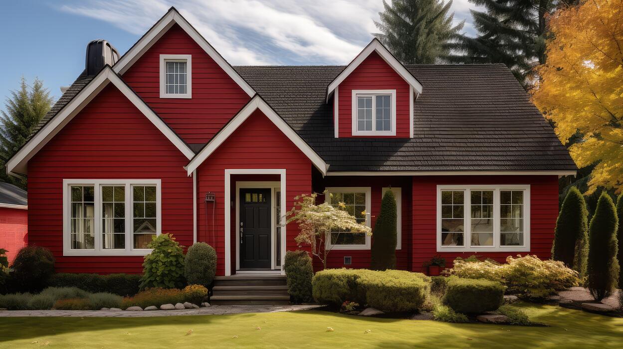
Picking an exterior color combination feels straightforward until you are standing in front of a paint display with 300 options and no clear starting point. The stakes are higher than most people realize.
According to Zillow research, the right color choices can increase what buyers offer for a home by thousands of dollars, while the wrong ones can actively reduce it. And even if you are not selling, the exterior is what every neighbor, guest, and passerby sees first.
Color choice is only part of it. The combination matters just as much. A great body color paired with the wrong trim or accent can undermine the whole look. Get it right, and the house looks intentional, polished, and finished. Get it wrong, and even a fresh coat of paint can make a home look off.
Here is a practical breakdown of the exterior paint color combinations for homes that consistently work, why they work, and how to apply the right logic to your own property.
Start With What You Cannot Change
Before you look at a single color swatch, take stock of the fixed elements in your home. Roof shingles, brick, stone, concrete, and wood accents all have undertones that will interact with whatever you paint on the siding and trim. These are the elements you are building your palette around, not against.
If your roof has warm brown or tan tones, cool grays and stark whites will fight it. If you have red brick, colors with orange or pink undertones tend to clash. Pull the dominant tones from those fixed materials first, then find body and trim colors that extend or complement them.
This is the step most homeowners skip with exterior house color schemes, and it is usually why a color that looked right in a photo or on a chip ends up looking wrong on the actual house.
How Exterior Color Combinations Work
Most homes use three color zones: the body (siding), the trim (fascia, window frames, corners), and the accent (front door, shutters, garage door). Getting the relationship between those three right is what separates a cohesive exterior house color scheme from one that looks like a series of random decisions.
A reliable rule is to keep the body color as the anchor, use a trim color that either contrasts or closely coordinates, and reserve the accent color for one or two focal points. Trying to use four or five colors across the exterior almost always creates visual noise.
Body Color
This is the dominant surface and should carry the most weight. Neutrals dominate here for good reason. Warm whites, soft grays, greige tones, navy, and sage green all hold up well across different lighting conditions and architectural styles. The body color sets the tone for everything else.
Trim Color
Trim defines the edges and architecture of the house. A crisp white or off-white trim on a darker body creates clean contrast and makes the structure read clearly. On a lighter body, a trim in a slightly deeper or warmer tone adds definition without creating a hard break. Matching trim to the body color exactly tends to flatten the best exterior paint colors and lose detail.
Accent Color
The front door is the most common accent point in exterior painting, and it is where you have the most room to be intentional. A well-chosen accent color draws the eye toward the entry and gives the exterior some personality without taking over. It should connect back to the body or trim through shared undertones, not clash with both.
Exterior Paint Color Combinations That Work
These are some of the most dependable exterior paint color combinations for homes across a range of styles and regions.
White or Off-White Body With Black or Dark Trim
This is one of the most requested house paint color ideas right now, and it earns that status. The contrast is high, the look is clean and modern, and it works across architectural styles from colonial to farmhouse to new construction.
An off-white body softens the contrast slightly and reads warmer than pure white, which tends to look stark without perfect sunlight.
For the accent, deep charcoal, navy, or forest green on the door all work well. For more variety, a similar color scheme can be used for deck staining. Avoid warm browns here as they tend to break the crispness of the palette.
Gray Body With White Trim and a Bold Front Door
Gray is one of the most versatile exterior paint colors available. A medium gray body paired with bright white trim is sharp without being aggressive. The front door becomes the focal point of the whole scheme, and almost any saturated color works: red, navy, hunter green, or black all complement the gray base well.
The thing to watch with gray is the undertone. Cool grays work well in shaded environments or with silver and black hardware. Warm grays pair better with natural materials like wood and stone. Testing in your actual light conditions before committing is not optional here.
Navy or Deep Blue With White Trim
Navy has moved well beyond just coastal homes. It is now one of the most popular exterior paint colors across traditional, craftsman, and contemporary styles. Against white trim, it creates a timeless, high-contrast palette that photographs well and holds its appeal over time.
A brass or black front door fixture against a navy door or accent wall reads particularly well. Avoid pairing navy with warm beige trim as the undertone difference becomes obvious and distracting.
Warm Greige or Taupe Body With Earthy Trim
Greige sits between gray and beige and is one of the most buyer-friendly curb appeal paint colors because it appeals to a wide range of tastes. It works especially well with brick, stone, and natural wood accents because the warm undertones do not compete with those materials.
Pairing a greige body with a slightly deeper taupe or warm brown trim keeps the whole palette cohesive. A soft black or deep olive door adds a grounded, finished look to the entry.
Sage Green or Muted Olive With Cream or Natural Wood Accents
Green exteriors have gained significant ground in recent years. Sage and muted olive tones feel connected to the landscape, which makes them particularly effective on homes with mature trees or substantial landscaping. They pair naturally with cream or off-white trim and with natural cedar or wood accents.
These tones sit in the cool-neutral range, which means they read differently depending on sun exposure. In direct afternoon sun, they can look warmer. In shade, they shift cooler. Testing multiple sides of the house matters here more than with most color families.
Common Mistakes With Exterior Color Schemes
Ignoring the Roof
The roof covers more visible surface area than most people account for. A warm brown shingle under a cool gray body creates a split that the eye picks up immediately. Always evaluate your color combinations with the actual roof shingles in view.
Choosing Trim That Matches the Body Too Closely
Matching trim and body color to the same shade flattens the exterior and removes architectural definition. Trim exists to frame and define. It needs enough contrast to do that job, even if just a few shades in either direction.
Skipping the Test Phase
Paint colors on a screen or a chip look nothing like they will on your actual siding, under your specific lighting, next to your roof and landscaping. Paint large samples on multiple sides of the house and live with them for a few days before making a final call. It is the only reliable way to evaluate exterior paint color combinations for homes.
Using Too Many Accent Colors
Every additional color added to an exterior scheme multiplies the ways it can go wrong. One strong accent color, placed intentionally, is almost always more effective than three competing ones. Restraint is not a limitation here. It is the approach.
How Architecture Should Guide Your Color Choice
Not every color combination suits every style of home. The architecture is a constraint that works in your favor if you use it correctly.
Traditional homes like colonials and craftsmans tend to read best in classic palettes: white, cream, navy, forest green, and warm gray with clearly defined trim. These styles have strong lines and detailed trim work that benefits from contrast rather than monochrome.
Modern and contemporary homes can handle more unusual combinations because the clean geometry does the structural work. Matte black, deep charcoal, concrete gray, and even warm terra cotta work well when the lines of the house are simple and uncluttered.
Ranch and farmhouse styles sit somewhere in the middle. They are versatile enough to carry both classic and modern palettes, but they tend to look best when the color scheme connects to the surrounding landscape rather than contrasting against it sharply.
Exterior House Painting Services from Fresh Coat Painters of Cranberry TWP
At Fresh Coat Painters of Cranberry TWP, we work with homeowners to take the guesswork out of exterior color selection and execute the final result with clean, durable craftsmanship. Whether you know exactly what you want or are still working through the options, our team is equipped to help you get it right the first time.
Reach out today for a free quote and see what a properly prepared, professionally painted exterior actually looks like from the street.