
Front Door Checklist: Choose a Color That Works Year Round in Hudson and Medina
Why a Front Door Color Deserves More Thought Than a Quick Decision
Homeowners throughout Hudson, Medina, Akron, and the surrounding Northeast Ohio communities often treat their front door color as a relatively minor decision, something chosen quickly based on a passing preference or whatever happens to be a popular trend at the moment. This undersells just how much weight a front door color actually carries. It is one of the first details anyone notices approaching a home, it sets an immediate tone for the property's overall character, and unlike many interior color choices that can be swapped out relatively easily, a front door repaint is enough of an undertaking that most homeowners want the color they choose to genuinely work well for years, across every season Northeast Ohio brings rather than just the specific mood or light conditions present on the day the color was chosen.
This is exactly why a front door color deserves a more deliberate evaluation than many homeowners initially give it. A color that looks striking on a bright June afternoon needs to also hold up visually against a gray November sky, a snow-covered landscape in January, and the full range of natural light and surrounding foliage color that a Northeast Ohio property experiences across a full year.
How the Changing Seasons Actually Affect a Front Door's Appearance
A Northeast Ohio home's exterior surroundings shift dramatically across the seasons in a way that few other regions experience as distinctly, and a front door color that seems well chosen in one season can look surprisingly different once the surrounding landscape transforms. Summer brings lush, deep green foliage and generally the most intense, direct natural light of the year, which tends to make bold, saturated door colors read as vibrant and energetic against the surrounding greenery. The same door color, once fall arrives and foliage shifts to oranges, reds, and browns before eventually dropping entirely, sits against a very different visual backdrop, and a color that complemented deep summer green may either clash with or beautifully complement autumn's warmer palette, depending on the specific hue chosen.
Winter presents perhaps the most dramatic shift, with snow cover creating a stark white backdrop and significantly reduced natural light for a much larger portion of each day. A door color that appeared warm and inviting against a colorful summer or fall landscape can look either strikingly bold or somewhat out of place against snow and bare winter trees, depending on how well the specific shade was chosen with this seasonal extreme in mind. Spring, with its emerging greenery and generally brighter, cleaner light than winter's often overcast skies, brings its own visual context that a truly well-chosen door color needs to complement as well.
This seasonal variation is precisely why choosing a front door color based only on how it looks during a single visit to the paint store, or judged only against how the house looks on the day the color is chosen, tends to produce a less satisfying long-term result than a color chosen with this full seasonal range genuinely in mind.
Color Approaches That Tend to Hold Up Across Every Season
Certain color families and approaches tend to perform more consistently across Northeast Ohio's full seasonal range than others, which is worth understanding before settling on a specific choice. Deep, rich colors, including navy blues, forest greens, and deep burgundies or reds, tend to read as sophisticated and grounded regardless of season, since their depth and saturation do not rely heavily on matching a specific seasonal backdrop the way a more delicate or trend-driven color might. These colors tend to look equally at home against summer greenery, autumn's warm tones, and winter's starker backdrop, which is part of why they remain such enduringly popular front door choices across many years and many different regional climates.
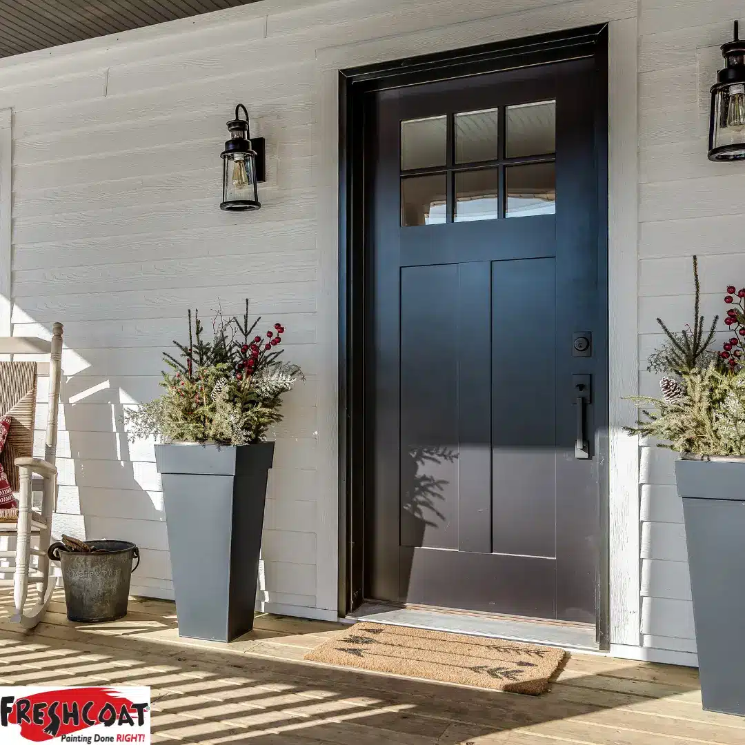
Classic black, while sometimes considered a safe or unoriginal choice, genuinely earns its popularity through this exact seasonal versatility, since black provides strong visual contrast against literally any backdrop a Northeast Ohio property experiences throughout the year, from bright green summer landscaping to stark white winter snow. This versatility is a legitimate practical advantage rather than simply an indication of limited creativity in color selection.
Warm neutrals and earthy tones, including certain terracottas, warm browns, and muted golds, offer a different but similarly durable seasonal approach, tending to feel grounded and inviting across the full range of seasonal backdrops without the higher-contrast statement that a very dark or very bold color makes. These tones can be a particularly strong choice for homes with warm-toned brick, stone, or siding, since they tend to work with the existing exterior palette across every season rather than needing to compete with or stand apart from it.
Brighter, more trend-driven colors, while capable of looking wonderful, deserve more careful seasonal consideration before committing, since a color that reads as cheerful and current against one season's backdrop can occasionally feel visually disconnected against another. This does not mean bold or trendy colors should be avoided entirely, but it does mean testing them specifically against a mental or literal image of how the home looks in multiple seasons, not just the season in which the color is actually being chosen.
How to Actually Test a Color for Year-Round Performance
The most reliable way to evaluate whether a specific front door color will genuinely work across all four seasons is to look at physical paint samples directly against the door and surrounding trim, viewed at different times of day and, if possible, mentally or photographically compared against how the property looks during other seasons based on past photos of the home's exterior throughout the year. A color that a homeowner has photos of the house from winter, spring, summer, and fall can genuinely compare a paint sample against each of these seasonal backdrops, either literally holding a sample up against printed photos or simply considering how the specific hue would interact with each season's distinct lighting and landscape context.
Considering the door color in relationship to the home's other fixed, unchanging exterior elements, roofing color, brick or stone if present, and any other permanent architectural features, matters just as much as considering seasonal backdrop, since these fixed elements remain constant across every season and the door color needs to work with them regardless of what is happening in the surrounding landscape at any given time. A color that photographs beautifully against green summer landscaping but clashes with the home's roofing or brick has a problem that persists across every season, not just the ones where the clash happens to be less visually obvious.
When to Choose Boldness Anyway, Despite the Seasonal Consideration
None of this seasonal analysis is meant to suggest that every front door should default to the safest possible neutral or deep classic color out of fear of seasonal mismatch. Some homeowners genuinely want a front door that makes a bold, current statement, and are willing to accept that the color might read slightly differently, though not necessarily worse, across different seasonal backdrops. This is a legitimate personal choice, and a bold color thoughtfully chosen with at least some seasonal awareness in mind can absolutely be the right call for a homeowner who values a distinctive, memorable entry over the specific goal of seamless consistency across every season of the year.
The key distinction is intentionality. A homeowner who chooses a bold, trend-forward color while understanding how it will look in winter, and who is comfortable with that seasonal variation, is making a genuinely informed choice. A homeowner who chooses the same color without ever considering how it interacts with the full range of Northeast Ohio's seasonal backdrop may be setting themselves up for a repaint sooner than they originally intended, simply because the color never quite worked as well as they hoped across the full year.
How Front Door Orientation Affects Color Performance Too
Beyond seasonal backdrop, the direction a front door faces plays a meaningful role in how any chosen color actually performs throughout the year, since sun exposure varies considerably by orientation and affects both how a color looks day to day and how well it holds up over time. A south-facing front door receives the most consistent, direct sunlight throughout the year, which means colors here tend to appear brighter and more saturated than the same shade would on a less sun-exposed door, and darker colors on a south-facing door will also experience more UV-related fading over time, worth factoring into both the color choice and expectations for how often a repaint might be needed.
A north-facing front door, by contrast, receives more consistent, indirect light without the same intensity of direct sun, which means colors here tend to read slightly cooler and less vibrant than the same shade would on a sun-drenched south-facing door. This is worth considering particularly for lighter or more delicate colors, which can sometimes appear a bit flat or underwhelming in this more muted light without the boost that direct sun provides elsewhere. East and west-facing doors experience their own distinct lighting patterns, with east-facing doors getting bright morning light and cooler afternoon light, and west-facing doors experiencing the reverse, both of which are worth observing directly at a potential paint sample before finalizing a decision.
Understanding a specific door's orientation, and testing paint samples directly on that door rather than relying solely on how a color looks in a showroom or on a small chip, gives homeowners a much more accurate sense of how their chosen color will actually perform in the specific lighting conditions their home experiences throughout each day and across the full year.
Coordinating Door Color With Other Exterior Accents
A front door rarely exists as a completely isolated color decision, and thinking through how it relates to other exterior accents, house numbers, light fixtures, a mailbox, and any visible trim immediately surrounding the entry, produces a more cohesive and more consistently satisfying result across every season than choosing the door color in complete isolation from these other elements. Metal fixtures in particular are worth considering alongside door color, since warm metals like brass or bronze tend to pair especially well with warmer door colors and earthy tones, while cooler metals like matte black or brushed nickel often complement deeper, more dramatic door colors like navy or forest green especially well.
This kind of coordinated approach also tends to age better across multiple seasons than a door color chosen without any consideration of its immediate surroundings, since a well-coordinated entry reads as intentional and put-together regardless of what is happening in the broader landscape at any given time of year, which reinforces exactly the kind of seasonal consistency this entire evaluation is aiming to achieve in the first place.
Frequently Asked Questions
Is black really a good front door color, or is it just an overused safe choice? Black genuinely earns its popularity through practical versatility, providing strong visual contrast against virtually any seasonal backdrop a Northeast Ohio home experiences, from summer greenery to winter snow, which is a legitimate advantage rather than simply an unoriginal default.
How can I test a color against winter conditions if I'm choosing in the middle of summer? Looking at past photos of your home during winter, if available, and holding a paint sample up against those images, or simply considering how the specific hue's depth and warmth will read against a snow-covered, more muted winter backdrop, are both useful ways to evaluate this without waiting for winter to actually arrive.
Do I need to match my front door color to my roof or brick? Not necessarily match exactly, but the door color should work harmoniously with these fixed, unchanging exterior elements, since they remain constant across every season while the surrounding landscape changes considerably throughout the year.
Is it a mistake to choose a trendy, bold color for a front door? Not necessarily, as long as the choice is made with genuine awareness of how that color will look across different seasons. The mistake is choosing a bold color without any consideration of seasonal variation and then being surprised when it doesn't perform as expected in a different season.
How often do front doors typically need to be repainted? This varies based on the door material, sun exposure, and paint quality, but many exterior doors benefit from a fresh coat every three to five years, making it worth choosing a color you're confident will hold up well across that entire span of changing seasons.
What's the safest color family for a front door that needs to work with almost any home exterior? Deep, rich tones like navy, forest green, and deep burgundy, along with classic black, tend to be the most broadly versatile choices, working well with a wide range of siding, brick, and roofing colors across every season.
Choose a Front Door Color That Works All Year Long
A well-chosen front door color enhances a home's curb appeal across every season Northeast Ohio brings, from summer's lush greenery to winter's stark snow, rather than looking its best for only part of the year. The team at Fresh Coat Painters of Hudson & Medina brings the color consultation expertise and exterior painting experience to help homeowners throughout Hudson, Medina, Akron, and the surrounding communities choose and apply a front door color that genuinely holds up year-round.
Call us at 330-474-3346 or visit freshcoatpainters.com/locations/hudson-medina to schedule your free painting quote throughout Hudson, Medina, and the greater Akron area.