
The Best Neutral Paint Colors That Match Any Furniture Style
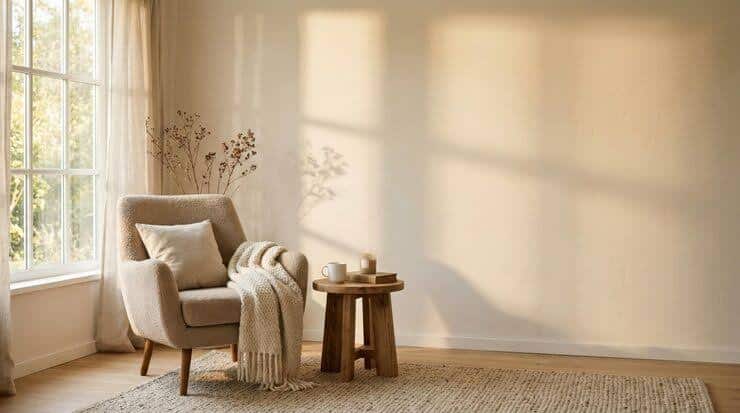
Choosing a paint color should feel simple, but it rarely does. The moment you start comparing shades, everything begins to blur together. What looked like a clean white suddenly feels too stark. That soft gray starts leaning blue. And somehow, every option feels like a risk.
This is exactly why neutral paint colors remain the most reliable choice. According to housing insights from the Texas Real Estate Research Center, neutral interiors tend to make homes more appealing to a wider range of buyers, helping spaces feel move-in ready and easier to personalize.
Instead of trying to match your walls to a specific piece of furniture or a passing trend, neutrals create a steady foundation that works with everything you already own, and anything you might bring in later.
What Makes a Neutral Paint Color Truly Versatile
At first glance, neutral shades can seem interchangeable. Beige is beige, gray is gray, and white is just white. But once you start applying them to real walls, the differences become impossible to ignore. Some feel warm and inviting, while others come across cold or flat. The ones that work across different styles and spaces have something very specific in common; they’re balanced.
Understanding what makes certain shades stand out as versatile paint colors comes down to three things: undertones, lighting, and how the color behaves over time.
Undertones Matter More Than You Think
A color doesn’t exist in isolation. It responds to light, and that response can completely change how it looks throughout the day. Natural sunlight tends to soften and warm up tones, while artificial lighting can either enhance warmth or bring out cooler undertones, depending on the bulbs you use.
A shade that looks perfect in a showroom might feel entirely different once it’s on your wall. North-facing rooms often make colors appear cooler, while spaces with strong sunlight can amplify warmth. This is why even the best neutral wall colors need to be seen in context before you commit.
The One Rule: Test Before You Commit
There’s no shortcut around this step. Testing a color in your own space is what separates a confident decision from an expensive mistake. A small sample on the wall lets you see how the color shifts from morning to evening and how it interacts with your furniture.
It may feel like an extra step, but it’s the simplest way to ensure that the neutral you choose actually works the way you expect it to. And when you’re aiming for something timeless, that extra bit of certainty matters.
Best Neutral Paint Colors That Go With Any Furniture
When people search for the best neutral paint colors that go with any furniture, what they’re really looking for is peace of mind. They want to know that whatever they choose won’t limit them later. The good news is that you don’t need to guess. Certain categories of neutrals consistently perform well because they’re naturally adaptable.
Warm Neutrals That Add Softness
Warm neutrals create a sense of immediate comfort. They have a softness that makes a room feel lived-in without appearing dated. Shades like creamy whites, gentle beiges, and warm greiges work especially well in spaces where you want a relaxed, inviting atmosphere.
These tones pair effortlessly with wooden furniture, brass accents, and more traditional pieces. They don’t demand attention, but they quietly elevate the room's overall look. If your goal is to make a space feel welcoming and cohesive, warm neutrals tend to deliver without much effort.
Cool Neutrals for a Clean, Modern Look
Cool neutrals lean toward gray-based tones and crisp whites. They bring a sense of clarity and structure to a space, which is why they’re often associated with modern interiors. When used well, they make a room feel open, polished, and intentional.
These shades work particularly well with minimalist furniture, metal finishes, and clean lines. They create contrast without adding visual clutter. This allows your furniture to stand out more clearly.
If you’re aiming for a refined, contemporary feel, cool neutrals are often the easiest way to get there.
True Neutrals That Work in Any Space
Somewhere between warm and cool sits the most flexible category of all.
True neutrals don’t strongly favor one undertone over another. Instead, they shift slightly depending on their surroundings, which makes them incredibly adaptable.
This is why they’re often considered the best neutral paint colors that go with any furniture. They don’t lock you into a specific style. Whether your space evolves toward something more modern or more traditional, these shades continue to work in the background without needing to be replaced.
Popular Neutral Paint Colors Designers Always Recommend
There’s a reason certain shades keep showing up in well-designed homes. The most popular neutral paint colors have been tested across different spaces, lighting conditions, and furniture styles. They’ve proven themselves to be reliable, which is exactly what most homeowners are looking for.
Classic Whites That Never Fail
White may seem like the simplest choice, but it’s often the most nuanced.
A bright, stark white can feel harsh, while a softer white with a hint of warmth creates a more comfortable atmosphere. The difference is subtle, but it has a major impact on how a room feels.
The most dependable whites are the ones that avoid extremes. They don’t lean too cold or too creamy, which allows them to work across a wide range of interiors.
When chosen carefully, white becomes a backdrop that enhances everything else in the room.
Go-To Greiges That Work Everywhere
Greige has earned its reputation for a reason. By blending gray and beige, it captures the best of both worlds. It has enough warmth to feel inviting and enough coolness to stay modern.
This balance makes it one of the easiest choices if you’re unsure where your style sits. It adapts to different types of furniture and lighting conditions, which is why it’s often recommended as a safe but elevated option.
Soft Taupes That Add Depth Without Overpowering
Taupe offers a slightly richer alternative to lighter neutrals. It adds depth without making a space feel heavy, which makes it ideal for rooms that need a bit more presence.
Unlike darker colors that can dominate a space, taupe stays understated. It enhances the room rather than taking it over, making it a strong choice for anyone who wants something a little more distinctive while still staying within the neutral range.
Popular Neutral Paint Colors Designers Always Recommend
Even when you choose the best neutral paint colors that go with any furniture, the way you pair them still matters. The goal is to create balance, not just match tones.
Matching With Dark Wood Furniture
Dark wood has a strong presence, so it benefits from contrast. Lighter neutrals help offset its depth and prevent the room from feeling too heavy. A soft white or warm beige can highlight the richness of the wood while keeping the space open.
Pairing With Light or Minimalist Furniture
With lighter furniture, you have more flexibility. You can introduce slightly deeper neutrals as an accent wall to add dimension without overwhelming the space. This creates a subtle contrast that keeps the room from feeling flat.
Making Bold or Colorful Furniture Work
When your furniture makes a statement, your walls should step back. A balanced neutral allows bold pieces to stand out without competition. This is one of the main reasons people rely on the best neutral paint colors that go with any furniture; they simplify the entire design process.
Popular Neutral Paint Colors Designers Always Recommend
From helping you narrow down the right neutral shade to delivering clean lines and a smooth, even finish, our team at Fresh Coat Painters of Marble Falls makes the entire process of interior painting straightforward and stress-free. If you’re ready to refresh your space with results that actually look as good as you imagined, now’s the time to get started. Reach out today to get a free quote and turn those paint swatches into a finished room you’ll love walking into.