
Best Paint Colors for Open Concept Homes
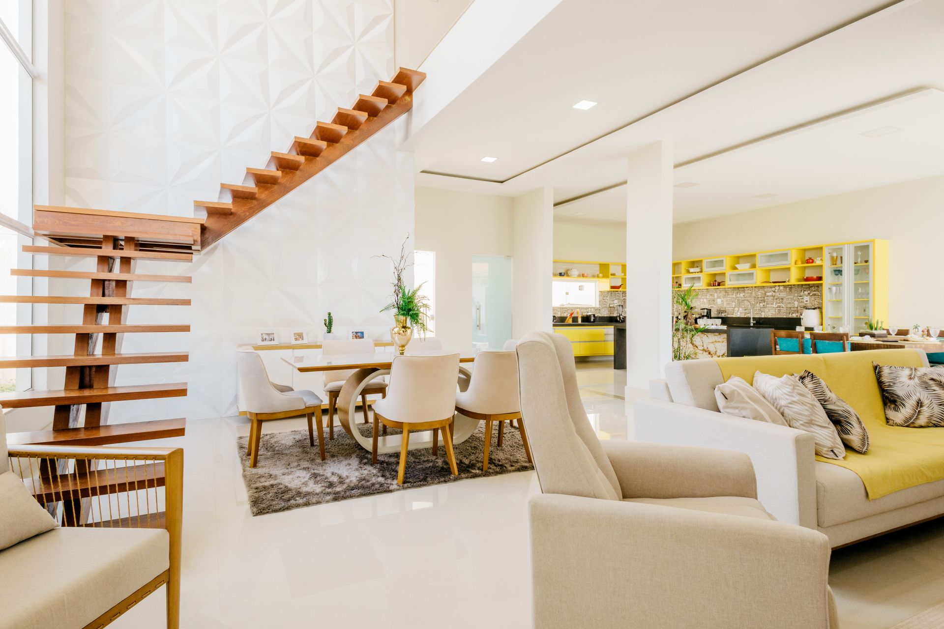
Open concept layouts are among the most requested features in residential real estate. According to the National Association of Home Builders "What Home Buyers Really Want" report, more than 80% of homeowners want at least a partially open kitchen and dining room setup. That popularity comes with a specific paint challenge that closed-layout homes do not face: without walls to contain each room, color choices in one area affect every other area in the homeowner's line of sight.
Get the palette wrong, and an open concept space can feel fragmented, busy, or visually inconsistent. Get it right, and the color does exactly what the architecture intended: it connects the space, creates a sense of continuity, and still allows each zone to feel intentional rather than like a single undifferentiated room.
Here is a practical breakdown of how to approach paint colors for open concept homes, which color families perform best, and the techniques that create cohesion without turning every wall into the same shade.
Why Paint Color Is More Complex in Open Concept Spaces
In a conventional floor plan, each room has four walls and a door. Color decisions are contained. A bold choice in the bedroom does not compete with the kitchen because you cannot see both from the same vantage point. In an open concept home, that containment is gone.
Standing in most open concept living areas, a homeowner can see the kitchen, the dining area, and the living room simultaneously. Any color on any surface in that sightline is in visual conversation with every other color. A combination that looks coherent in a paint store sample can read as chaotic or jarring when spread across three adjacent zones with no walls to separate them.
This is why the approach to open floor plan paint ideas needs to be more strategic than simply picking a color you like for each area. The colors need to work as a system, not as individual room decisions.
The Foundation: Choose a Primary Color That Works Across All Lighting
Open concept spaces are frequently multi-directional, meaning they face both north and south or both east and west, depending on the home's orientation. That means light conditions shift significantly throughout the day and across different sections of the same open space. The kitchen may receive warm afternoon sun while the living area sits in cooler indirect light at the same time of day.
When thinking about how to choose paint colors for open floor plans, pay attention to the primary wall color as it needs to hold up under both conditions without reading as two different colors in the same space. This rules out highly directional colors, ones that look warm in one light and cool in another, and favors balanced neutrals with complex pigmentation that read consistently regardless of light source.
Warm whites, greiges, soft taupes, and balanced warm grays are the most reliable primary colors for interior painting open concept spaces for exactly this reason. They are not exciting choices, but they are functional ones. The visual interest in an open concept home comes from layering through furniture, textiles, and accent colors, not from the base wall color doing all the work.
Paint Colors That Work Best in Open Concept Homes
Warm White and Off-White
Warm white is the single most versatile primary color for open concept spaces. It reflects light effectively across the entire footprint, makes the space feel airy and expansive, and functions as a neutral backdrop that allows every other element in the room to read clearly. The warmth in the undertone prevents it from feeling clinical under cooler light conditions and keeps it from yellowing under warm artificial light in the evenings.
The practical advantage of warm white as a primary open concept color is that it does not compete with fixed elements such as flooring, cabinetry, and countertops. It reads as background rather than as a competing element, which is exactly what a dominant color in a large, open space should do.
Small variations in sheen between the kitchen, living area, and dining zone can create subtle differentiation without introducing contrasting colors.
Warm Greige and Soft Taupe
Greige, the blend of warm gray and beige, is one of the most widely used paint colors for open concept homes because it solves the multi-directional lighting problem better than most alternatives. Its balanced undertone sits between warm and cool enough that it reads consistently across north and south-facing surfaces within the same space.
Soft taupe operates on the same principle with slightly more warmth, and works best for paint color flow between rooms. Both colors pair naturally with the wood tones, stone surfaces, and neutral textiles that dominate most open concept interiors. They also have the practical advantage of hiding dust and fingerprints more effectively than stark white, which matters in a high-traffic, highly visible space with no walls to contain the mess.
Warm Sage and Muted Soft Green
Soft greens have moved into the primary color position in open concept homes with increasing frequency. Warm sage and muted eucalyptus tones feel connected to the natural materials that characterize modern interiors, including wood, stone, linen, and rattan, and that connection creates a cohesive look across a large open space without the predictability of a neutral.
The key with green as a primary open concept color is saturation. Muted, desaturated greens with gray or beige in their undertones read as sophisticated neutrals and hold up across varied lighting. Saturated or bright greens become dominant in a large open space and compete visually with everything else in the room. The target is a green that reads as warm and organic rather than vivid.
Warm Charcoal and Deep Neutral
Deep neutrals, including warm charcoal, dark greige, and rich brown-gray, can work as primary colors in open concept spaces with significant natural light and high ceilings. In these conditions, a deep primary color creates a grounded, dramatic backdrop that reads as intentional rather than heavy.
The risk with deep colors in open concept spaces is that they absorb light rather than reflecting it, which can make already-limited natural light feel even more constrained. In Reidsville homes and similar climates where overcast days are common, testing a deep neutral under worst-case light conditions before committing is essential.
A color that works beautifully on a bright afternoon can feel oppressive on a gray winter morning across a 1,200 square foot open floor plate.
Creating Color Flow Between Rooms
Paint color flow between rooms in an open concept home is achieved through one of three approaches: a single color throughout, a tonal progression, or a weave method. Each produces a different result and suits different preferences.
Single Color Throughout
Painting the entire open concept space in a single color is the simplest approach and the most cohesive. It removes the challenge of making multiple colors work together across a large, visible sightline and creates a unified, expansive feel that emphasizes the openness of the layout.
The limitation is that it can feel monotonous in a very large space. Varying the sheen between zones addresses this without introducing color contrast. Satin walls in the kitchen and living area with a flat finish in the dining zone create subtle differentiation that reads as intentional without disrupting the visual continuity.
Tonal Progression
A tonal progression uses three shades from the same color family, typically a light, a medium, and a slightly deeper version, across the three zones of an open concept space. The kitchen might carry the lightest shade, the dining area the medium, and the living area the deepest, or the progression can move in the opposite direction depending on light conditions and the desired emphasis.
This approach creates visible differentiation between zones while keeping the palette cohesive because all three colors share the same undertone and color family. It is particularly effective in open concept homes where the zones are large enough that the progression reads as deliberate rather than as an inconsistent repaint.
The Weave Method
The weave method uses two or three colors across the open space but introduces them as supporting elements throughout rather than confining each color to a single zone. A soft sage used as an accent wall in the living area might reappear as a cabinet color in the kitchen island. A warm taupe used on the main walls might return in the dining area built-in.
This technique creates cohesion through repetition rather than through a single dominant color, and it allows more personality and visual interest than a monochrome approach. It requires more planning and more intentional placement than the other two methods, but produces the most layered and sophisticated result when executed correctly.
Where to Change Colors in an Open Concept Home
One of the most common questions homeowners ask about open floor plan painted ideas is where colors should start and stop when walls are continuous across multiple zones. The answer is to use the architecture rather than fighting it.
Corners where two walls meet are the most natural transition points because the eye expects a change at a corner. A color change that happens mid-wall without any architectural feature to justify it looks like an error rather than a decision. Interior columns, archways, transitions in ceiling height, and changes in flooring material are all legitimate anchors for a color transition.
Trim and crown molding painted in a consistent color across the entire open concept space, regardless of what color the walls are in each zone, is one of the most effective techniques for maintaining visual cohesion while allowing wall colors to vary. The consistent trim creates a unifying framework that holds the different colors together visually without requiring them to be identical.
What to Avoid in Open Concept Color Schemes
Highly saturated, strongly contrasting colors in adjacent zones are the most reliable way to make an open concept space feel chaotic. A deep teal living room next to a warm yellow kitchen visible from the same sofa creates visual competition that is exhausting to live with, regardless of how good each individual color might look in a contained space.
Treating each zone as a separate color decision without considering the combined sightline is the underlying mistake. Cohesive paint colors for the whole home require thinking about how colors interact across the full visible space, not just how each one looks in isolation on a chip or in a single room photo.
Cool and warm colors used in equal measure across an open space can also create tension. A space that is half cool gray and half warm beige does not read as balanced. It reads as two separate decisions that were not made in conversation with each other. Committing to one temperature direction as the dominant note across the space, with the other temperature used sparingly as an accent, produces a more resolved result.
Interior Painting Services from Fresh Coat Painters of Reidsville
At Fresh Coat Painters of Reidsville, we work with homeowners to develop color strategies for open concept spaces that create flow and cohesion across the full footprint rather than treating each zone as a separate painting decision. If you have an open floor plan and are trying to figure out how to approach the color selection, our team can help you navigate the options before any paint is purchased.
Contact us today for a free quote and find out what a thoughtfully planned and professionally executed interior paint job looks like in an open concept home.