
Paint Colors That Make a Room Look Bigger
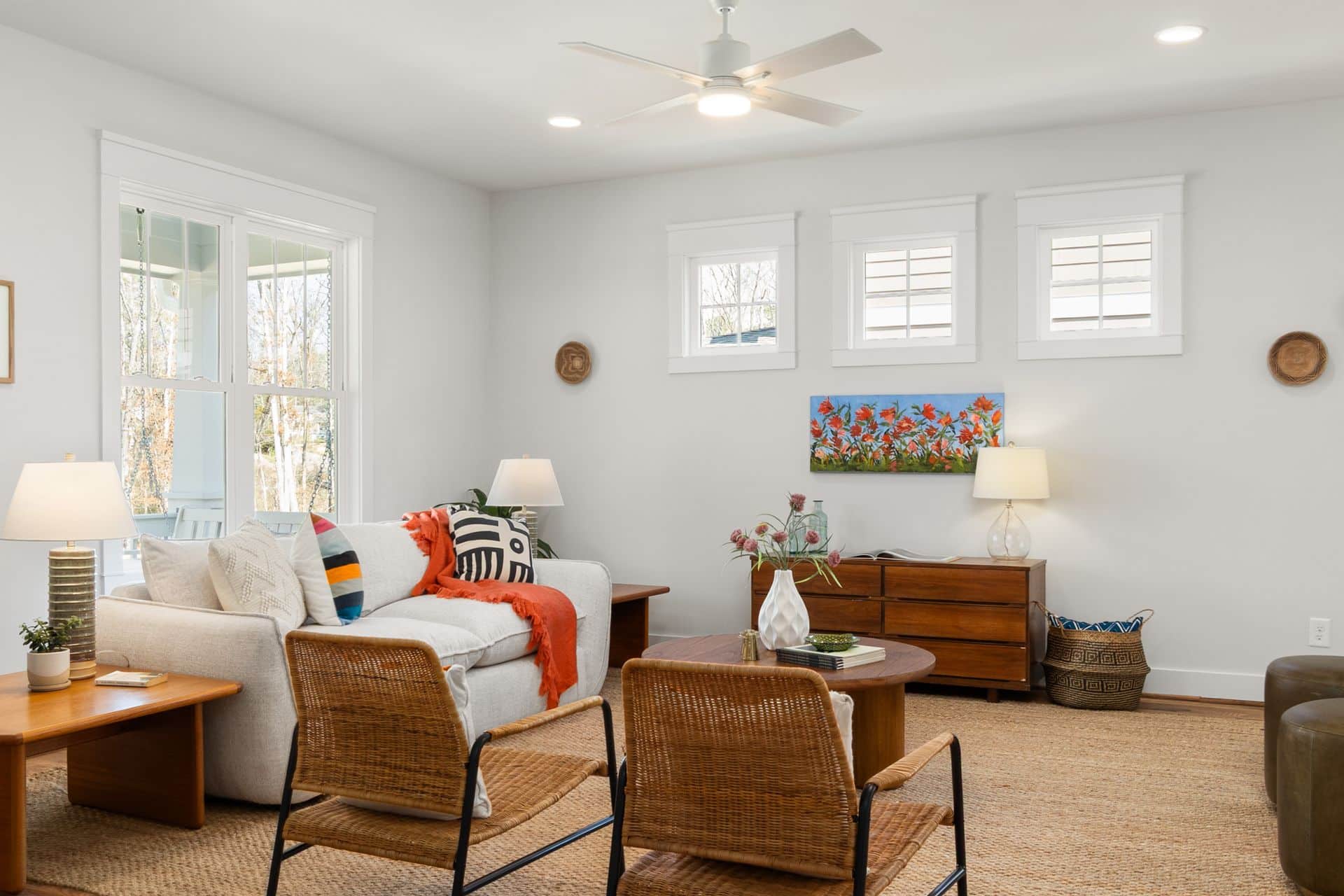
The size of a room is fixed. How large it feels is not. Color is the most cost-effective tool available for changing the perceived dimensions of any space, and the science behind it is straightforward. Every paint color has a Light Reflectance Value (LRV), measured on a scale from 0 to 100, that indicates how much light the color reflects into a room. Colors with a high LRV reflect more light, which makes walls appear to recede, ceilings feel taller, and the overall space read as larger than it is. Colors with a low LRV absorb light, which draws surfaces visually closer and makes spaces feel more enclosed.
This is not a subjective effect. It is a measurable perceptual phenomenon that interior designers, paint manufacturers, and color experts account for every time they work in a constrained space. Understanding it gives homeowners a reliable framework for choosing paint colors that make a room look bigger rather than relying on guesswork or trend-following.
Here is a practical breakdown of which colors work, why they work, and how to apply the right techniques in the rooms where space is most limited.
The Science Behind Why Color Changes Perceived Room Size
When light hits a painted wall, one of two things happens. Either the color reflects that light into the room, which pushes the wall surface visually outward, or it absorbs the light, which pulls the wall visually inward. The degree to which each happens is determined by the LRV of the color.
A white with an LRV of 85 reflects 85 percent of the light that hits it. A deep charcoal with an LRV of 5 absorbs 95 percent. In a small room, that difference is visible and significant. The high-LRV white makes the boundaries of the room feel indistinct and expansive. The low-LRV charcoal defines those boundaries sharply and brings them closer.
Paint finish compounds the effect. Flat and matte finishes scatter light rather than reflecting it directionally, which softens the room but reduces the reflectance boost. Satin and eggshell finishes reflect light more efficiently, amplifying the space-expanding effect of a high-LRV color. This is why the combination of a light color and a satin finish consistently outperforms a light color in a flat finish when the goal is making a small room look bigger with paint.
The Best Paint Colors for Small Rooms
The colors that reliably expand the perception of a small space share a common trait: they sit in the upper range of the LRV scale and have undertones that work with the existing light in the room rather than fighting it.
Warm White and Off-White
Warm whites are the most reliable paint colors to make a room look larger. Shades like Sherwin-Williams Alabaster, Benjamin Moore White Dove, and similar warm off-whites carry
LRV values in the 80s, which means they reflect the vast majority of available light back into the room. The warmth in their undertone prevents the space from feeling clinical or cold, which is the risk with stark cool whites in rooms that lack significant natural light.
Off-white is particularly effective in rooms with low ceilings. Painting both the walls and ceiling the same warm white removes the visual boundary between the two planes, which creates the perception of additional height. The eye travels upward without interruption, and the room reads as taller and more open as a result.
Soft Gray and Greige
Soft grays and greiges, the blend of gray and beige, sit in the mid-to-high LRV range and reflect light effectively while adding more visual interest than a straight white. They work particularly well in rooms that receive cool or indirect light, where a stark white can read as flat or slightly blue-toned.
The key with gray in a small room is undertone. Cool grays with blue or green undertones can make a north-facing room feel colder and smaller if the existing light is already cool. Warm grays and greiges with tan or beige undertones absorb the warmth in whatever light is available and reflect it back into the space, making the room feel both larger and more inviting. Testing samples under the actual lighting conditions of the room before committing is especially important in this color family.
Pale Blue and Soft Aqua
Blues have a specific perceptual effect that makes them particularly effective light paint colors for small spaces. Cool tones recede visually, which means a pale blue wall appears to sit further back
than it actually does. Color experts describe this as a color that “recedes,” giving the illusion of additional depth in the room.
Pale blue and soft aqua work best in rooms with at least some natural light. In rooms that are already dark, a cool blue can read as gray or even slightly purple, which loses the receding effect.
For darker, small rooms, a warm pale blue with slightly yellow or green undertones maintains the receding quality while adding warmth that counteracts the limited light.
Pale Yellow and Warm Cream
Yellow is highly reflective and responds strongly to available light, which makes pale yellow and warm cream among the most effective colors for interior painting. In a basement bathroom, a small interior bedroom, or any room without windows, a pale yellow creates the impression of sunlight even when none is present.
The caveat is saturation. Deep or vivid yellows have lower LRV values and can feel aggressive in a small space. The target is the pale, muted end of the yellow family, where the LRV stays high, and the warmth is subtle rather than dominant. Cream and warm ivory fall into this category and are among the most versatile choices for low-light small rooms.
Pale Sage and Muted Soft Green
Soft greens, particularly in pale sage and muted eucalyptus tones, have gained significant traction as space-expanding colors in recent years. They share the receding quality of blue but carry warmth that makes them more comfortable in rooms with limited natural light. They also work
exceptionally well in rooms where greenery or natural materials are present, since the color connects to rather than contrasts with organic elements in the space.
Pale sage reads differently depending on the light in the room. In warm light, it sits toward yellow-green. In cool light, it reads closer to gray-green. Both readings are flattering in most small room applications, which makes this family more forgiving than pure blues or cool grays when the lighting situation is unpredictable.
Painting Techniques That Amplify the Effect
Color choice is the foundation, but how the color is applied and where it is used across the room significantly affects the final result.
Paint the Ceiling the Same Color as the Walls
Most people paint ceilings white regardless of wall color, which creates a visible horizontal line where the wall ends and the ceiling begins. That line defines the height of the room and caps it visually. Removing it by painting the ceiling the same color as the walls, or a slightly lighter version of that color, eliminates the boundary and allows the eye to travel upward without interruption. The room reads as taller because there is no visual signal telling it to stop.
This technique works best with lighter wall colors. A dark accent wall color carried onto the ceiling creates an enveloping effect that can feel cozy but not expansive. For the goal of making a small room look bigger, a light unified palette across walls and ceiling is the most effective application.
Paint Trim and Molding the Same Color as the Walls
Contrasting trim creates visual interruptions that break the wall into segments. Each segment reads as a separate plane, which emphasizes the actual dimensions of the room. Painting trim the same color as the walls or in a very close shade eliminates those interruptions and allows the wall to read as a single continuous surface. The room feels less segmented and therefore larger.
This runs counter to the traditional advice of painting trim white for contrast, which works well in larger rooms where the contrast adds architectural definition. In a small room, that definition comes at the cost of perceived space.
Use a Single Color Throughout the Space
Multiple wall colors in a small room create zones, and zones make a small room feel like a collection of even smaller spaces. A single color applied consistently throughout the room, including connecting hallways or adjacent areas where possible, creates visual continuity that extends the perceived boundaries of the space. The eye reads the room as one unified area rather than a series of defined sections.
Colors to Avoid in Small Rooms
Knowing which colors work against the goal of visual expansion is as useful as knowing which ones support it.
Deep, saturated colors with low LRV values, including dark navy, forest green, burgundy, and charcoal, absorb more light than they reflect and bring walls visually closer. They can create a compelling, intimate atmosphere in the right context, but they work against the perception of space in an already small room.
Warm, bold colors like terracotta, burnt orange, and deep red are similarly absorptive and carry the additional effect of advancing toward the viewer rather than receding. In a small room, an advancing color reduces the sense of depth and makes the space feel more confined.
High-contrast color combinations, such as one dark accent wall against light walls, create a focal point but also visually segment the room. The contrast emphasizes the wall it is applied to, which draws attention to the boundary of the space rather than allowing the eye to move freely through it.
Interior Painting Services from Fresh Coat Painters of South Denver
At Fresh Coat Painters of South Denver, we help homeowners choose colors that work for their specific space, lighting conditions, and goals, whether that is making a small room feel more open, creating a cohesive look across multiple rooms, or simply getting a clean, professional finish on a project that has been on the list too long.
Contact us today for a free quote and find out what a thoughtfully chosen, professionally applied paint job looks like in your home.