
How To Choose Exterior Paint Colors That Boost Curb Appeal
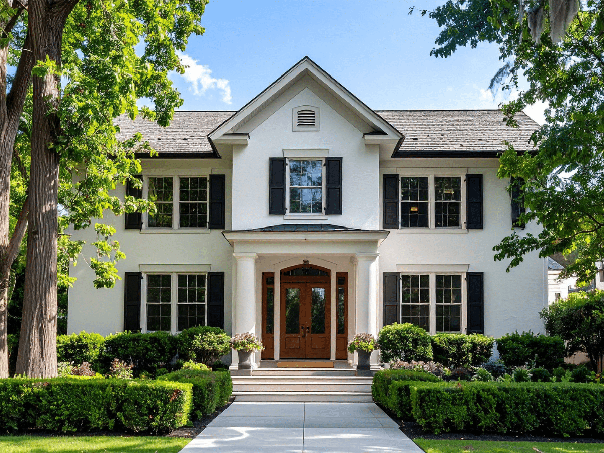
Choosing the right exterior paint color isn’t just about taste; it directly influences how buyers perceive your home the moment they see it. According to Zillow’s Buyer Housing Trends, curb appeal consistently ranks as one of the top factors shaping first impressions and early interest in a property. In competitive markets like Texas, where buyers often make quick decisions based on online photos and drive-bys, the exterior color of your home can quietly impact how valuable and well-maintained it appears.
If you’ve been trying to figure out how to choose exterior paint colors without getting stuck in endless swatches, the key is to approach it strategically. It’s not about picking a color you like in isolation; it’s about how that color works with your home’s structure, surroundings, and natural light. When everything aligns, the result feels intentional, polished, and instantly more appealing.
Start with the One Thing Most Homeowners Ignore: Context
Your Roof, Stone, and Hardscaping Set the Rules
Before you even open a paint catalog, take a hard look at what’s already fixed. Your roof, brickwork, stone accents, and even your driveway carry undertones that don’t change. These elements quietly dictate what will work and what won’t. If your roof has warm brown undertones and you introduce a cool gray exterior, the mismatch may not jump out immediately, but it will always feel slightly off.
A smarter approach to choosing exterior paint colors starts with working with these elements instead of against them. Treat them as your base palette, and your paint choices will feel far more cohesive.
How Neighborhood Aesthetics Influence Buyer Perception
You don’t need to copy your neighbors, but your home should still feel like it belongs. Buyers are naturally drawn to homes that feel cohesive within their surroundings. A house that stands out too aggressively can come across as jarring rather than impressive.
The goal is balance. You want your home to feel distinct, but still aligned with the overall character of the street. That’s where curb appeal actually works in your favor.
Why Lighting Can Completely Shift How a Color Looks
Exterior paint doesn’t behave the way it does indoors. Sunlight, shadows, and even nearby trees can shift how a color appears throughout the day. A shade that looks soft and balanced in the morning might appear washed out at noon or too heavy in the evening.
This is one of the most overlooked parts of how to choose exterior paint colors, and it’s also where many decisions go wrong. If you don’t account for lighting, you’re not seeing the full picture.
How to Choose Exterior Paint Colors That Actually Work Together
Breaking Down Undertones
Every color has an undertone, and ignoring it is where most palettes fall apart. Warm tones carry hints of yellow, red, or beige, while cool tones lean toward blue or gray. Mixing them without intention creates subtle tension that makes a home feel visually disconnected.
When figuring out how to pick house exterior colors, the simplest rule is to stay consistent. If your fixed elements lean warm, your paint should too. That one decision alone eliminates a huge number of mistakes.
Why One Color Never Works Alone on an Exterior
An exterior isn’t a single surface; it’s a system. Siding, trim, doors, and architectural details all need to work together. Choosing one color and expecting it to carry the entire design usually leads to a flat, unfinished look.
Strong exterior color combinations for homes rely on layering two or three shades that complement each other. This creates structure and depth without making the design feel busy.
Creating Depth Without Overcomplicating the Palette
Depth doesn’t come from adding more colors; it comes from using contrast effectively. A slightly darker trim, a defined accent color, or a subtle variation in tone can create visual interest without overwhelming the exterior.
The goal is to guide the eye, not confuse it.
Exterior Color Combinations for Homes That Instantly Elevate the Look
High-Contrast Pairings That Add Definition
High-contrast combinations are one of the easiest ways to create a clean, structured look. A white exterior paired with black trim, for example, highlights architectural lines and makes the home feel more defined.
This approach works especially well for modern or updated properties.
Monochromatic Schemes That Feel Expensive
A more subtle approach is using different shades of the same color. Layered neutrals or soft tonal variations create a cohesive look that feels refined and intentional.
It’s less dramatic than contrast, but often more sophisticated.
Using Natural Materials as a Third Color
Wood, stone, and brick can act as built-in accents. Instead of trying to compete with these materials, incorporate them into your palette.
This creates a more grounded, natural look that feels complete rather than forced. H2: Best Exterior Paint Colors for Curb Appeal
Trends might catch your eye, but curb appeal is built on colors that hold up over time. The goal is to choose something that feels current without becoming dated too quickly.
Safe Neutrals That Still Look Intentional
Neutrals remain some of the best exterior paint colors for curb appeal because they appeal to a wide range of buyers and adapt well to different styles. Soft whites, warm beiges, and balanced greiges create a clean, timeless foundation that doesn’t feel boring when done right.
Dark Exteriors Done Right
Darker colors like charcoal, navy, or even black can look striking, but they need balance. Without contrast, they can feel heavy.
Pairing them with lighter trim or natural textures keeps the look sharp instead of overwhelming. H3: Soft, Warm Tones That Feel Inviting
Warm, earthy tones create a welcoming feel that works especially well in residential painting. Muted greens, taupes, and clay-inspired shades offer personality without being too bold or risky.
How to Pick House Exterior Colors Based on Architectural Style
Modern Homes: Clean Lines, Bold Contrast
Modern homes are built around simplicity and structure, which means they can handle stronger contrasts and deeper tones without feeling overwhelming. Their clean lines and minimal detailing create a natural framework for bold color choices.
This is where high-contrast palettes (like crisp white paired with black trim, or deep charcoal with warm wood accents) really shine.
Traditional Homes: Balanced and Timeless Palettes
Traditional homes rely heavily on detail (moldings, trims, shutters, and layered facades), which means the color palette needs to support those elements rather than overpower them.
Softer, balanced combinations tend to work best here because they allow the craftsmanship of the home to remain the focal point.
Transitional Homes: Where You Can Experiment
Transitional homes sit somewhere between modern and traditional, which gives you more flexibility, but also more room to get it wrong if you’re not careful. These homes can handle updated neutrals, layered tones, and even slightly bolder accents, as long as the overall palette still feels controlled.
This is where you can start blending ideas, like pairing a warm neutral base with darker modern trim, or introducing a muted color as an accent without it feeling out of place.
The 60–30–10 Rule (And When to Break It)
If you need a simple framework to guide your choices, the 60–30–10 rule is one of the most reliable.
It works by dividing your exterior into three parts. The majority of your home (around sixty percent) should be your main color. Thirty percent is reserved for a secondary color, often used on trim or garage doors. The remaining ten percent is your accent, which might show up on the front door or in smaller details.
This structure creates balance without overcomplicating the design. It also prevents one of the most common issues: overusing accent colors or introducing too many competing elements.
That said, it’s not a rigid rule. Some homes benefit from softer contrast or slightly adjusted proportions. The key is to maintain visual balance so the eye moves naturally across the exterior rather than getting stuck on one overpowering feature.