
Warm vs Cool Paint Colors: Which Works Best for Each Room?
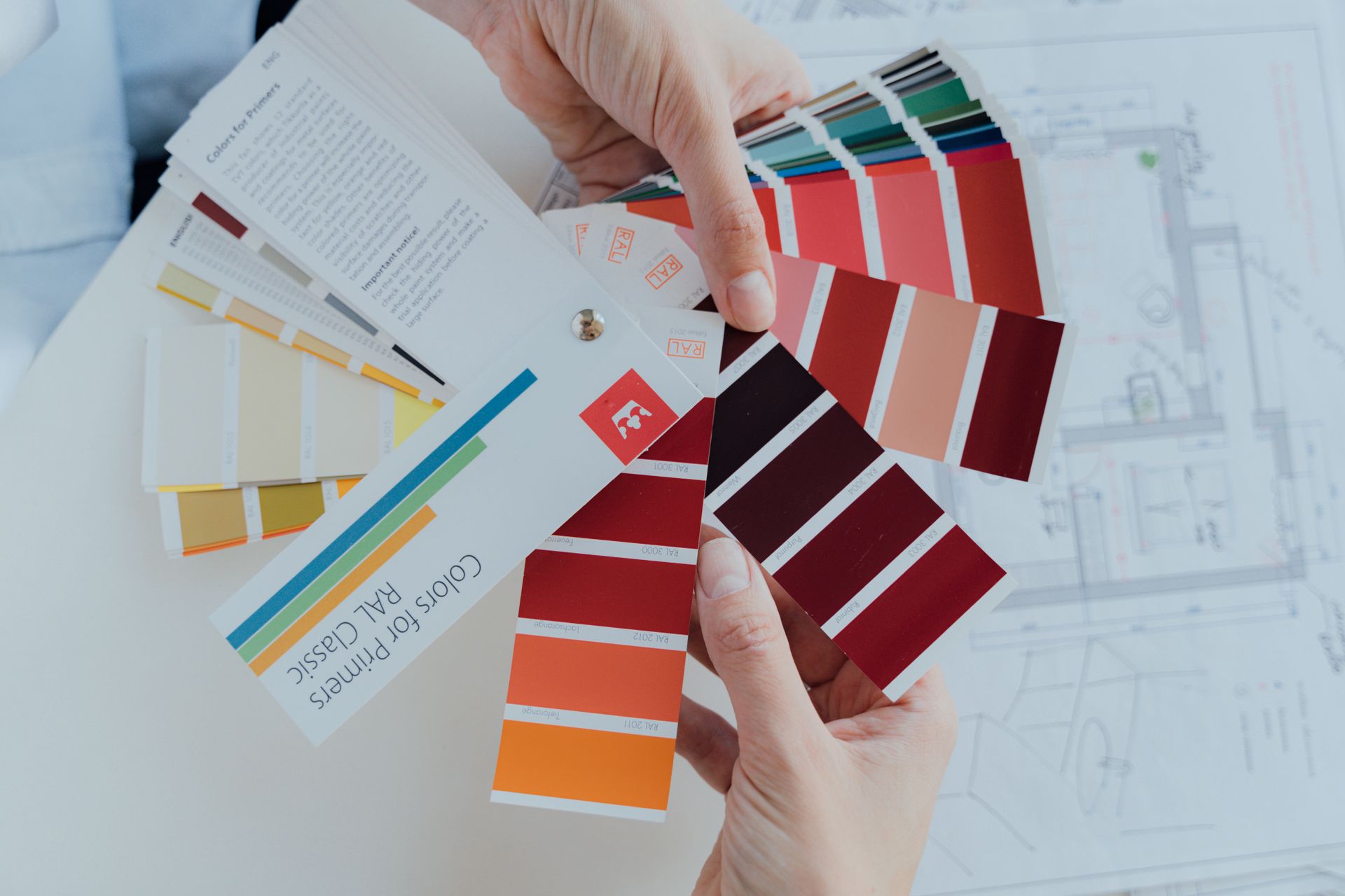
Most homeowners choose paint colors based on what looks appealing in the store or on a phone screen. That approach produces inconsistent results because it ignores the single most important variable in any color decision: how the room is used and what emotional state that use requires.
Research published in the Journal of Environmental Psychology confirms that the brain processes color not just visually but emotionally and physically, affecting everything from heart rate and sleep quality to appetite and cognitive focus. Color temperature, the distinction between warm and cool tones, is the primary mechanism through which those effects operate.
Warm colors, which include reds, oranges, yellows, and their variations, stimulate energy, appetite, and social interaction. Cool colors, which include blues, greens, and purples, promote calm, focus, and a sense of spaciousness. Neither is inherently better than the other. The right choice depends entirely on what a room is used for and what experience it needs to support.
Here is a room-by-room breakdown of how warm vs cool paint colors work in practice and which direction to go in each space.
Understanding Paint Color Temperature
The color wheel divides into two halves. Warm colors sit on the red, orange, and yellow side. Cool colors sit on the blue, green, and purple side. Neutrals, including whites, grays, and beiges, can lean either warm or cool depending on their underlying undertones, which makes them more complex to evaluate than they first appear.
A white with a yellow or cream undertone is a warm white. A white with a blue or gray undertone is a cool white. The same applies to grays: a gray with brown or tan undertones reads warm, while a gray with blue or green undertones reads cool. This distinction matters because neutrals make up the majority of interior paint choices, and a neutral chosen without understanding its undertone can produce a result that clashes with the existing elements in a room.
Paint color temperature also interacts with the direction a room faces and the type of light it receives. North-facing rooms receive cooler, indirect light throughout the day, which can make cool paint colors feel cold or flat. South-facing rooms receive warm, direct light that can make already warm colors feel overpowering. Understanding this relationship prevents the most common color selection mistakes.
Living Room: Warm Tones With Flexible Neutrals
The living room serves multiple functions. It is a space for relaxing, entertaining, and spending time with family, which means it needs to feel welcoming without being so energizing that it prevents unwinding at the end of the day.
Warm paint colors for the living room consistently outperform cool ones in terms of creating the inviting, comfortable atmosphere most homeowners are after. Warm neutrals, greiges, soft taupes, and creamy whites create a backdrop that feels settled and approachable. They also interact well with the warm wood tones and textile colors that dominate most living room furniture.
Soft warm colors in the mid-tone range, including warm sage, dusty terracotta, and muted gold, add more personality while maintaining the welcoming quality the room requires. What tends to underperform in living rooms are stark cool tones, particularly cool grays and cool whites, which can feel clinical rather than comfortable in a social space. If a cool tone is preferred, warming it through lighting and textiles is essential.
Bedroom: Cool Tones for Rest and Recovery
The bedroom is where the case for cool paint colors is most clearly supported by research. Sleep quality is directly affected by environmental stimulation, and color is one of the environmental variables that either supports or disrupts the body's ability to wind down.
Interior painting with warm colors, particularly reds and saturated oranges, raises heart rate and blood pressure, which is the physiological opposite of what the body needs to transition into sleep. Cool colors, particularly soft blues, muted greens, and pale lavenders, have the reverse effect. They lower physiological arousal and create a calm, quiet atmosphere that supports restful sleep.
Cool paint colors for bedrooms do not have to read as cold or sterile. Pale blue-greens with enough warmth in their undertones, soft sage greens, and muted blue-grays all deliver the calming benefits of cool color temperature while still feeling livable and comfortable. The goal is not a stark, institutional cool but a quietly serene one. Pairing a cool wall color with warm wood tones, soft lighting, and natural textiles bridges the two temperatures effectively.
Kitchen: Warm Tones That Stimulate Appetite and Energy
Kitchens benefit from warm color temperature more than almost any other room in the home. The function of a kitchen, cooking, eating, and gathering, is inherently social and active, and warm colors reinforce that energy rather than working against it.
Yellows and warm oranges are among the most appetite-stimulating colors available, which explains their historical dominance in food service and kitchen design. In residential kitchens, the application is usually more restrained than in a commercial setting, with warm yellows used as an accent, like in cabinet painting, rather than the dominant wall color. Terracotta, warm cream, and soft golden tones achieve the same appetite-stimulating warmth without overwhelming the space.
White kitchens remain popular, but the distinction between warm white and cool white is significant here. A warm white with cream or yellow undertones reads as clean and fresh while maintaining the inviting quality a kitchen needs. A stark, cool white can feel more like a laboratory than a kitchen and tends to highlight imperfections in the surface rather than softening them.
Bathroom: Cool Tones for a Spa-Adjacent Feel
The bathroom serves a specific emotional purpose: it is a space for transition, hygiene, and in many homes, a brief moment of quiet in an otherwise busy day. Cool colors align naturally with that function. They evoke cleanliness, calm, and the kind of refreshing quality that makes a bathroom feel like a retreat rather than a utility room.
Pale blues, soft grays, muted aquas, and cool whites all work well in bathrooms. They reflect the light that bounces off tile and fixtures, making the space feel bright and clean. In smaller bathrooms, cool colors with a high Light Reflectance Value also contribute to making the space feel larger than it is, which is a practical benefit alongside the aesthetic one. Warm tones in bathrooms are not wrong, but they require more care to execute well. A warm terracotta or earthy brown works in a larger bathroom with significant natural light and a deliberate design direction, with bathroom earth tones performing well among buyers. In a small, dark bathroom, a warm tone can make the space feel cramped and heavy rather than spa-like.
Home Office: Cool Tones With Neutral Grounding
The home office has become one of the most color-researched spaces in residential design as remote work has normalized. The findings are consistent.
Cool colors, particularly blue and sage green, reduce eye strain during sustained focus, support cognitive clarity, and lower ambient stress in a way that warm colors do not. Deep blues, muted greens, and cool neutral grays are the strongest performers in home office applications. They create a visual environment that is calm enough to sustain concentration without being so stark that it feels uninspiring. Warm grays are a useful middle ground for homeowners who want the grounding quality of a neutral without the coldness of a pure cool gray.
What consistently underperforms in home offices are highly saturated warm colors. Red, burnt orange, and vivid yellow raise energy in a way that can feel stimulating in a kitchen or dining room, but becomes distracting and mentally fatiguing in a space where sustained cognitive work is the goal.
Dining Room: Warm Tones That Drive Connection
The dining room is one of the best spaces in the home for committing to a warm, rich color. It is used for relatively short periods at a time, which means the intensifying and stimulating effect of warm colors does not become fatiguing the way it might in a room you inhabit for hours. The goal in a dining room is to create warmth, intimacy, and a sense of occasion.
Deep warm tones, including burgundy, terracotta, warm gold, and burnt sienna, create exactly that atmosphere. They make the room feel enclosed in a positive sense, drawing people inward and creating the kind of intimate setting that makes meals feel like events. Even in smaller dining rooms where conventional advice might suggest lighter, cooler colors to create the illusion of space, warm tones often produce a more satisfying experience because they lean into the compact scale rather than fighting it.
Dining rooms can also handle more saturation than other rooms in the home without feeling overwhelming, simply because of how they are used. A deep, warm accent wall behind a buffet or sideboard creates impact without requiring the full room to carry the color.
Entryway: Warm Tones That Create a First Impression
The entryway sets the emotional tone for the entire home. It is the first space a visitor experiences and the last space a resident passes through before leaving, which makes it a high-impact zone for color despite its typically small footprint.
Warm tones in entryways create an immediate sense of welcome that cool tones generally do not. A warm white, a soft terracotta, or even a deeper warm accent color tells visitors the home is inviting and lived-in. Cool tones in an entryway can read as formal or unwelcoming, depending on how they are executed.
The exception is an entryway that opens directly into a larger open-plan space. In that case, the entryway color should lead naturally into the adjacent room rather than creating a jarring temperature shift. If the main living area is painted in a warm neutral, the entryway should align with that direction rather than introducing a contrasting temperature.
How Lighting Affects Paint Color Temperature
Paint color temperature does not exist in isolation. The lighting in a room, both natural and artificial, shifts how warm or cool a color appears throughout the day and across seasons. North-facing rooms receive cool, indirect daylight. In these rooms, cool paint colors can feel cold or flat at certain times of day, which is why warm neutrals often perform better in north-facing spaces than the pure cool tones that look appealing in a well-lit store. South-facing rooms receive warm, direct light that can push already warm colors toward orange or yellow, making a slightly cooler choice more balanced in practice.
Artificial lighting compounds the effect. Bulbs with a color temperature below 3,000 Kelvin emit warm yellow light that amplifies warm paint tones. Bulbs above 4,000 Kelvin emit cool white light that makes cool paint colors feel crisper and can make warm tones look flat. Evaluating paint samples under the actual lighting conditions of the room at multiple times of day is not optional for accurate color selection. It is the step that prevents the most common and most frustrating paint color mistakes.
Interior Painting Services from Fresh Coat Painters of Tyler
At Fresh Coat Painters of Tyler, we help homeowners work through color temperature decisions before a single gallon is purchased. Getting the temperature right for each room is the foundation of a color scheme that feels intentional throughout the home rather than like a series of disconnected decisions.
Contact us today for a free quote and find out what a professionally executed interior paint job looks like when the color choices are made thoughtfully from the start.