Beat the Winter Blues: Cozy Interior Paint Colors That Make Your Home Feel Warm All Season Long

Winter in Kansas can feel long — gray skies, early sunsets, and that stretch of cold where you start counting the days until spring. Since we all spend a little more time indoors this time of year, your home has a big job: it should feel warm, inviting, and comforting.
One of the easiest ways to get that cozy, wrapped-in-a-blanket feeling?
A fresh paint color.
You don’t need a full remodel. You don’t need new furniture.
Sometimes a shift in color is all it takes to make the whole space feel different.
If you're thinking about warming up your home this season, here are some of the most beautiful (and surprisingly practical) winter-friendly color ideas — many of which we’ve used in real Wichita-area homes this year.
Moody Greens: Rich, Calm, and Perfect for Winter
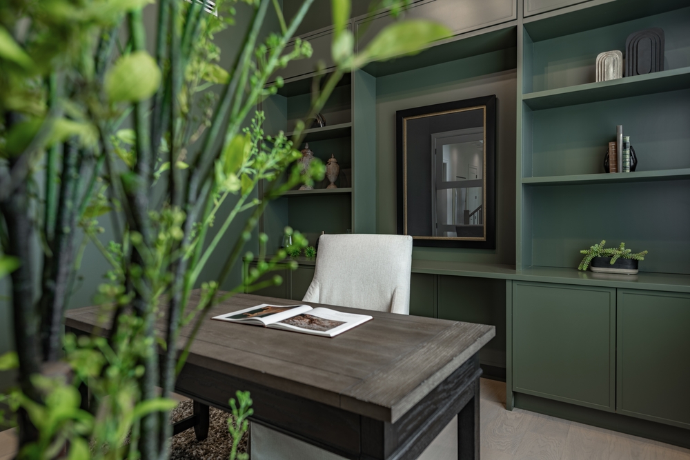
Deep greens have taken over design boards this year — and for good reason. They feel earthy, grounded, and instantly calming. They also look fantastic in winter light.
We recently painted a dining room in the Riverside area using Sherwin-Williams “Cascades” — a deep blue-green that turned the entire space into a warm, moody retreat. With soft lighting and wood accents, it felt like a boutique hotel tucked inside a Kansas home.
Other cozy green options:
- Evergreen Fog (SW 9130) – Soft and warm, not too dark
- Dried Thyme (SW 6186) – A relaxed, organic green
- Hunt Club (SW 6468) – Deep and dramatic without feeling heavy
Moody greens are especially beautiful in rooms where you want a sense of calm — bedrooms, offices, reading corners, or dining rooms.
Warm Neutrals That Feel Like a Soft Blanket
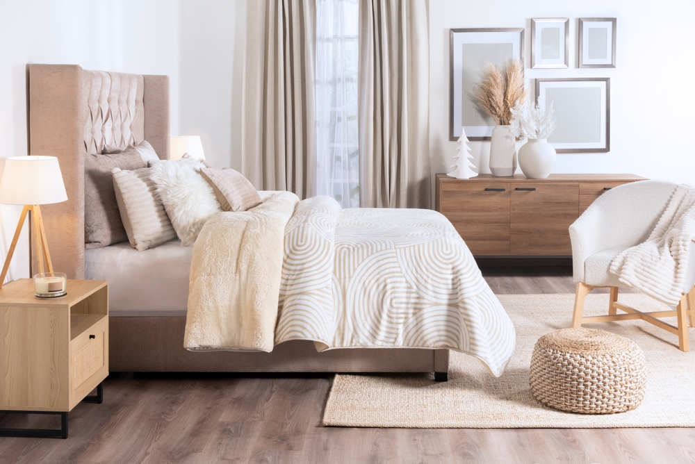
If winter has you craving comfort, warm neutrals are a great choice. They’re timeless, flexible, and instantly make a room feel lived-in (in the best way).
We used Sherwin-Williams “Accessible Beige” (SW 7036) in a newly remodeled Andover living room, and the homeowners couldn’t believe how much warmer the whole space felt. Pair it with natural textures — like woven baskets, blankets, or warm wood — and it creates a space people want to settle into.
Other warm neutrals we love:
- Canvas Tan (SW 7531)
- Neutral Ground (SW 7568)
- Agreeable Gray (SW 7029) — still a favorite, but with warmth
These colors are great if your home gets limited natural light during winter.
Earthy Browns & Soft Ambers: Surprisingly Modern
Browns and amber tones are having a big comeback — but not the heavy, muddy ones from the 90s. Today’s browns are soft, cozy, and full of personality.
Think coffee, caramel, cinnamon, and clay.
In a home outside Maize, we recently used Sherwin-Williams “Fawn Brindle (SW 7640)” on an accent wall in a home office. With warm lamp lighting, the color created a space that felt rich and comfortable all at once.
Here are the earthy tones homeowners gravitate toward:
- Fawn Brindle (SW 7640)
- Smoky Beige (SW 9088)
- Wheat Penny (SW 7705) – A warm amber that glows in evening light
These colors look especially good with black accents, gold hardware, or natural wood.
How Winter Lighting Changes the Way Paint Looks
One of the biggest surprises for homeowners is how much lighting affects paint — especially in winter.
Shorter days + softer light = colors looking slightly cooler.
Here’s what to keep in mind:
- North-facing rooms get cooler, bluer light → warmer tones look better
- South-facing rooms stay bright → darker or moodier colors work great
- Lamp lighting brings out warm undertones and makes neutrals look richer
- LED temperature matters (2700K–3000K looks coziest for winter)
Tip: Always look at a swatch in different lighting throughout the day. What looks beige at noon may look gray at 5 p.m. during winter.
How to Choose the Right Cozy Color for Your Space
Here are a few easy guidelines we use when helping clients choose winter-friendly colors:
If you want your room to feel bigger:
Choose a warm neutral — nothing too dark.
If you want your room to feel brighter:
Go for a soft beige or light green with warm undertones.
If you want your room to feel cozier or more dramatic:
Pick a deep green or warm brown — they bring instant comfort and personality.
If you want a room that feels warm no matter the weather:
Stick to colors with yellow, red, or brown undertones.
(You’ll feel the difference even if you can’t see it clearly.)
A Few Sherwin-Williams Color Chips to Spark Inspiration
Here are some winter-friendly favorites:
- Cascades (SW 7623) – Deep blue-green
- Dried Thyme (SW 6186) – Soft, earthy green
- Accessible Beige (SW 7036) – Warm and welcoming
- Smoky Beige (SW 9088) – Earthy and elegant
- Wheat Penny (SW 7705) – Amber warmth
- Canvas Tan (SW 7531) – A cozy, go-anywhere neutral
Even seeing these colors on a small card can help you imagine a fresher, cozier home.
Want Some Help Choosing the Right Winter Color?

Picking paint colors is one of the most exciting (and surprisingly tricky) parts of updating your home. If you want guidance — or if you’d like help painting before the real winter lows hit — Fresh Coat Painters is always here.
We can bring samples, test colors on your walls, or talk through what works best with your lighting and style.
Whenever you’re ready, we’re a quick call or message away.